Rate this article :
This article was useful to you ?
Yes
No
Vous avez noté 0 étoile(s)
Sommaire
Procédure
Divi builder is included in ourWordpress web hosting packages. If you would like support for DIVI builder, you must subscribe to a licence directly on the Elegent theme Divi website.
LWS offers 3 premium plugins from Elegant Themes (Divi, Bloom and Monarch). These are regularly updated. Once you are an LWS customer, you will have free access to these plugins by choosing the 'Divi Builder' distribution when installing the Wordpress CMS with our Auto-Installer.
If you have a cPanel package or have already installed Wordpress with this distribution, but do not have access to all the themes or updates, please let us know by giving us the access details for the administration area of your Wordpress site so that a technician can update the licence.
Please note: you will need to take out an Elegant Themes licence to benefit from support. LWS does not provide support for these products.
Bloom comes with a ton of different design settings, allowing you to adjust just about every aspect of your opt-in form. Once you've created a form and chosen a basic template, you'll be taken to the Design tab where you can continue to tweak various aspects of your design, as shown below.
Title and message
Here you can adjust the content of the text that appears in your opt-in.
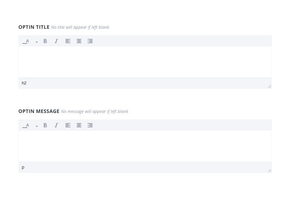
Title of the opt-in
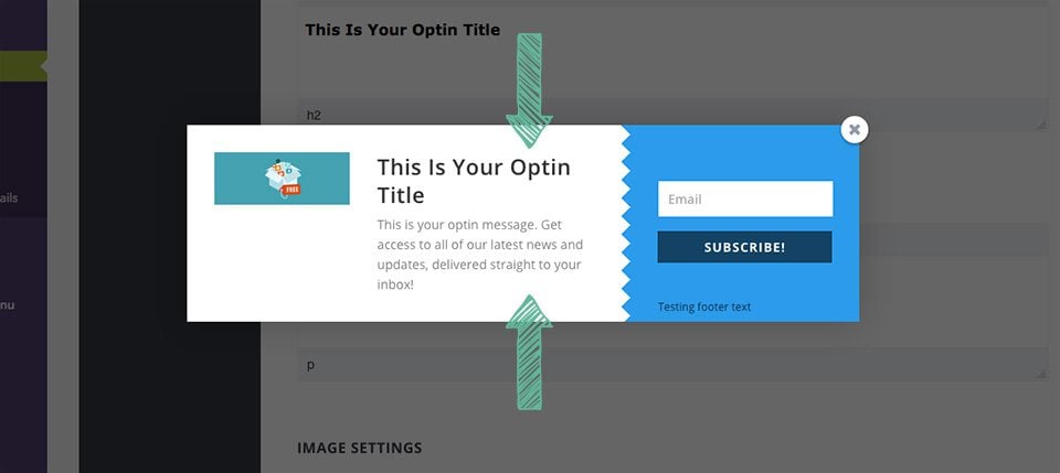
This is the header that will appear at the top of your form in large type.
Optin message
This text will appear below your header and will use a smaller font size.
The title and message fields can be used to describe your newsletter or special offer. They can also be left blank if you don't want to include any text in your opt-in. The title and message can be modified using the message editor, which gives you the option of adjusting the colour, weight and orientation of the font.
Here you can add an image to your opt-in, as well as adjust where that image appears in the opt-in box.
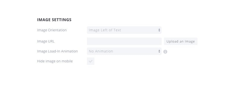
Image Orientation
This setting affects where the image appears in your opt-in form. You can choose to display the image above or below, or to the left or right of your title and message.
Image URL
This is the URL of the image you would like to use in your opt-in box. You can enter a custom URL to a static online resource, or you can click the"Upload Image" button to upload your own image to use in the form.
ImageLoad-In Animation
Images can be assigned a load-in animation. When the image is loaded for the first time, this animation occurs. It can be a nice subtle touch that attracts your visitors' attention and encourages them to read your message and subscribe to your list.
Hide image on mobile
If you're worried about the size of your opt-in form on mobile, you can choose to disable the image when browsing your website on mobile devices. This will hide the image on mobile and give more space for the title, message and input fields.
Here's an example of two opt-in forms with images enabled. One has the image on the left, while the second has the image below the text.

These design parameters affect the entire opt-in form and constitute a set of general styles for your form.
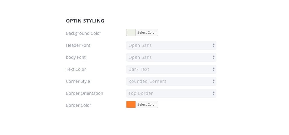
BackgroundColor
The background colour of your opt-in will change.
HeaderFont
Here you can change the font used for your opt-in title.
BodyFont
Here you can adjust the font used for your opt-in message.
TextColor
This will change the colour of your header and body. You can choose between "light" and "dark", depending on the background colour you have chosen. If you have chosen a dark background colour, make sure your text is set to 'light' so that it is visible. If your background colour is light, make sure the text colour is dark.
CornerStyle
Here you can choose a corner style for your op-tin. The selection of rounded corners will apply to the rounded corners on the outer edges of the opt-in box.
Border Orientation
Here you can add a border to your opt-in. This border can be applied to all 4 edges or just one.
Border Color
If you have chosen to have a border on your opt-in, then this border colour option will appear. Here you can select a colour to use for your opt-in border.
Here is an example of two opt-ins whose style has been adjusted. The one on the left has had its background colour changed to dark blue with a light text colour, while the one on the right has a white background colour with dark text. The registration form on the left has no border, while the one on the right has a full border.

If you have chosen to have a border, then you can adjust the style of the border here. As well as adjusting the colour in the previous section, you can also adjust the shape of the border.
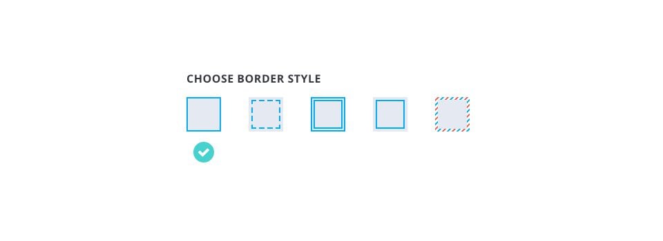
Solid
This is the most basic border style, and creates a thin, solid border around the edge of your opt-in.
Dotted
The dotted border creates a dotted line around the outer edge of your opt-in.
Double stroke
The double stroke is similar to the Solid border, except that it adds an extra solid inlay, creating the appearance of a double border.
Inlay
The inlay border creates a solid line border, but unlike the 'solid' border, this inlay border is placed inside the opt-in instead of on the outer edge.
Letter
This creates a more playful border, imitating a classic letter.
These styles apply to the form and the form input fields. You can adjust their colours, as well as where the form appears in the registration box.
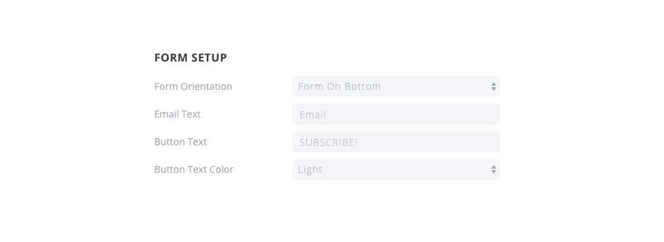
Form Orientation
This adjusts where the form fields appear in the acceptance dialog box. You can choose to display the form at the top, bottom, left or right of your title and article.
Email Text
This adjusts the replacement words used in the email entry form.
ButtonText
Here you can adjust the text that appears in the subscribe button.
Button Text Color
Here you can adjust the colour of the text used in the subscribe button.
Here is an example of two different forms whose form configuration parameters have been adjusted. The form on the left has its form position at the bottom, while the form on the right has its form position on the left.

These settings apply to the actual form inside the include box.
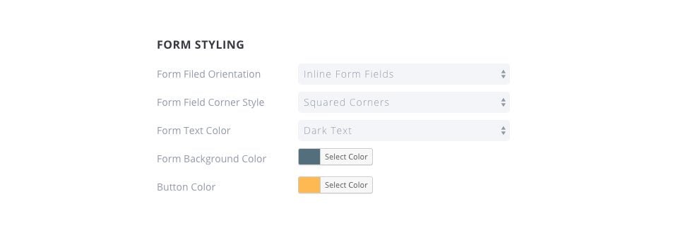
FormField Orientation
This adjusts the way the input fields appear in the form itself. You can choose to display your input fields 'inline' on a single line, or stack the fields on top of each other.
Form Field Corner Style
Here you can adjust the field corner style, choosing between rounded or square.
Form Text Color
Here you can adjust the colour of the text that appears in the form input fields. If you are using a light background colour, try to use a dark text field so that it is legible.
Form Background Color
This parameter allows you to switch to the form background colour. This, in combination with your opt-in background colour, makes up the two main colours of your opt-in box.
Form button colour (Button Color)
You can adjust the colour of your submit button here.
Here's an example of two different forms with adjusted settings. One has stacked forms, while the other has inline forms. In both cases, the background colour of the opt-in form has been adjusted, and the orange form has changed the colour of its button to white.

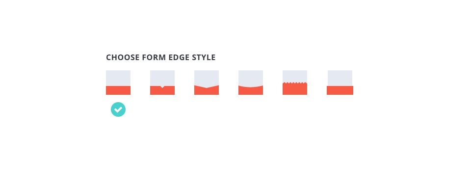
Form border style
Each opt-in box has a border that separates the form from the text content. Here you can apply different styles to this border, giving your opt-in box a unique feel.
These settings give you additional control over the items that appear when forms are submitted, as well as the ability to add custom CSS modifications to individual forms.
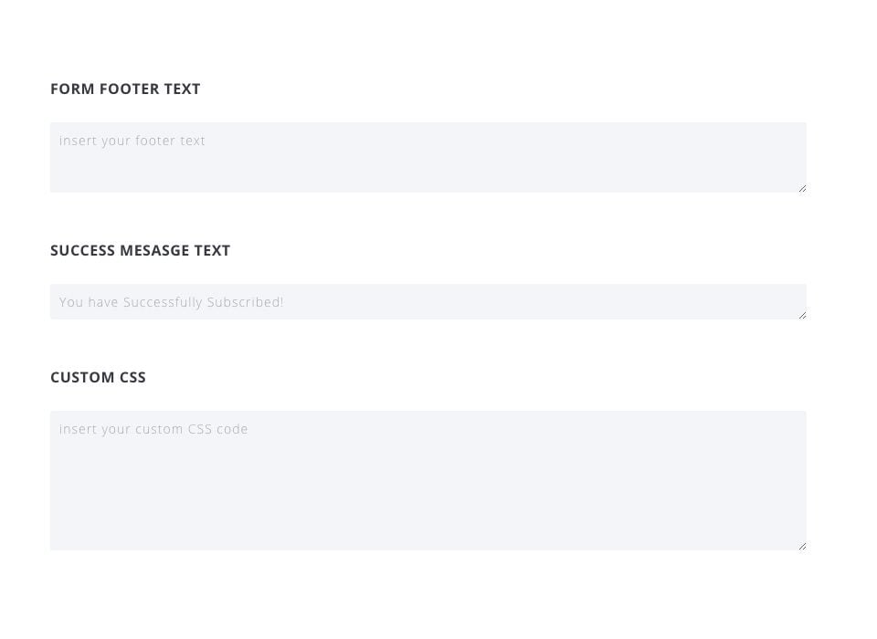
Form Footer Text
This message will appear below the form's input fields. A common use might be to link to a privacy policy or to assure your users that you won't spam or share their information.
Success MessageText
This is the message that appears after a visitor has successfully subscribed to your mailing list.
Custom CSS
Here you can add custom CSS that will only apply to the form you are building.
Bloom's design parameters allow for almost unlimited variations, customised to suit your site. So it's up to you now ;)
See you soon for a new tutorial!
Overview of the features of the Bloom plugin
Adding an email account to Bloom
> See our Bloom plugin help section
Rate this article :
This article was useful to you ?
Yes
No
3mn reading
How do I install the WordPress Bloom plugin?
4mn reading
Bloom plugin features at a glance
4mn reading
Adding an email account to Bloom
4mn reading
Using Bloom's Opt-in pop-up